5 Things Every Landing Page Should Have

The difference between a landing page and company website is simple: while the latter is an all-purpose website that people will access from your social media profile or general Google search, the landing serves a more specific purpose. It will usually be the endpoint of an ad campaign, may it be a social media banner campaign, a search ad campaign or even offline, through a special URL or QR code printed on a poster or magazine ad.
A landing page can be covering your whole product or be centered on one specific feature, problem or audience segment. In highly competitive spaces, a landing page can be used to compare your product against a popular competitor, trying to steal away their search traffic.
What all landing pages have in common is their purpose: They will try to convert a visitor into a paying customer – something that we call conversion design. To be successful with that, there is no cookie cutter formula: Every landing page is different, just as every product is different. If someone tries to tell you otherwise, they are probably trying to sell you their templated landing page builder.
However, there a few things that every successful landing page needs to have – regardless of content and design. At Human Deluxe, we have been creating a lot of landing pages – and these are the things that we learned on the way:
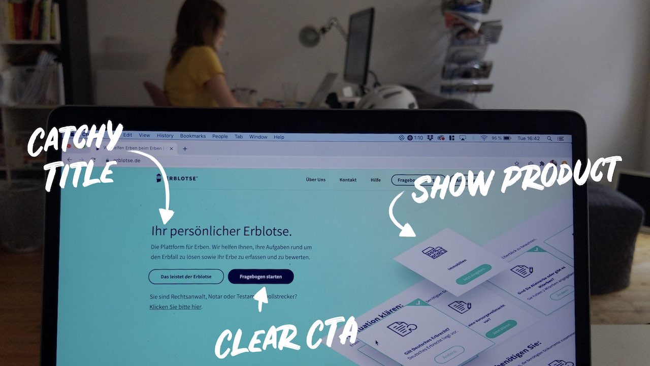
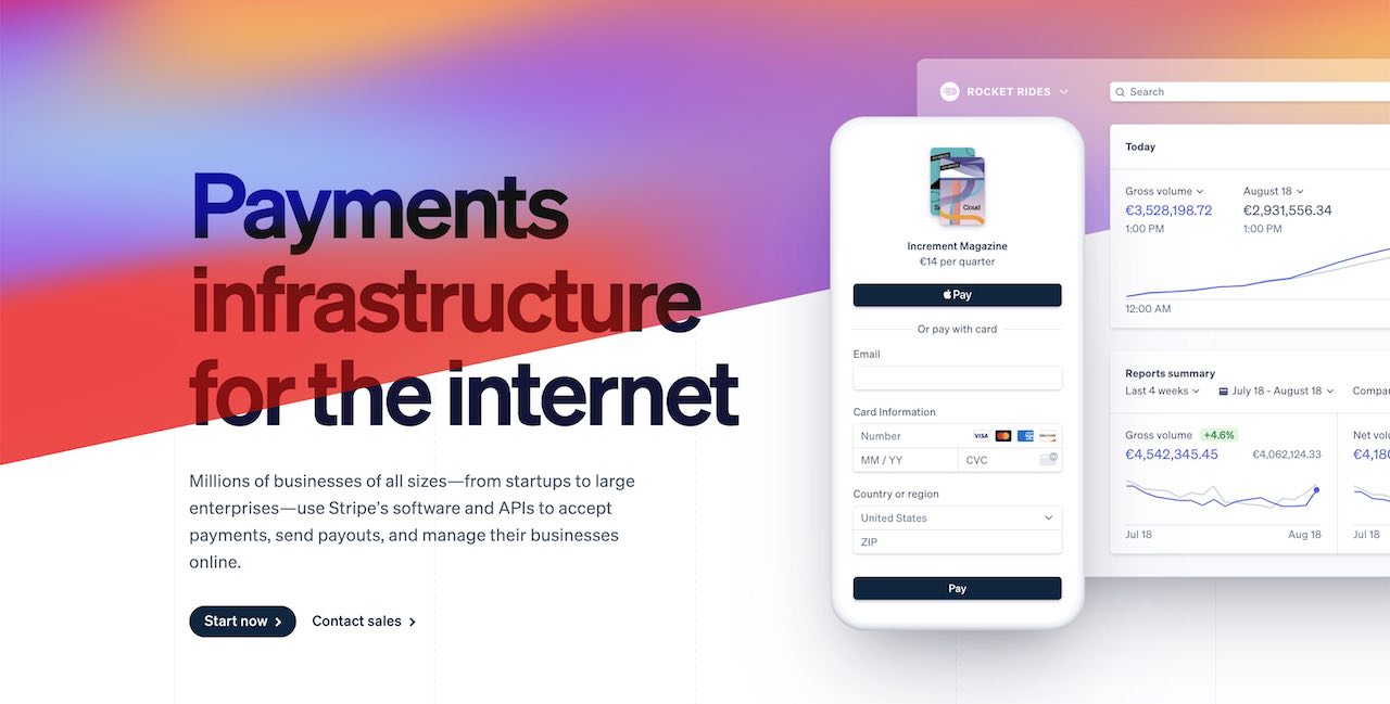
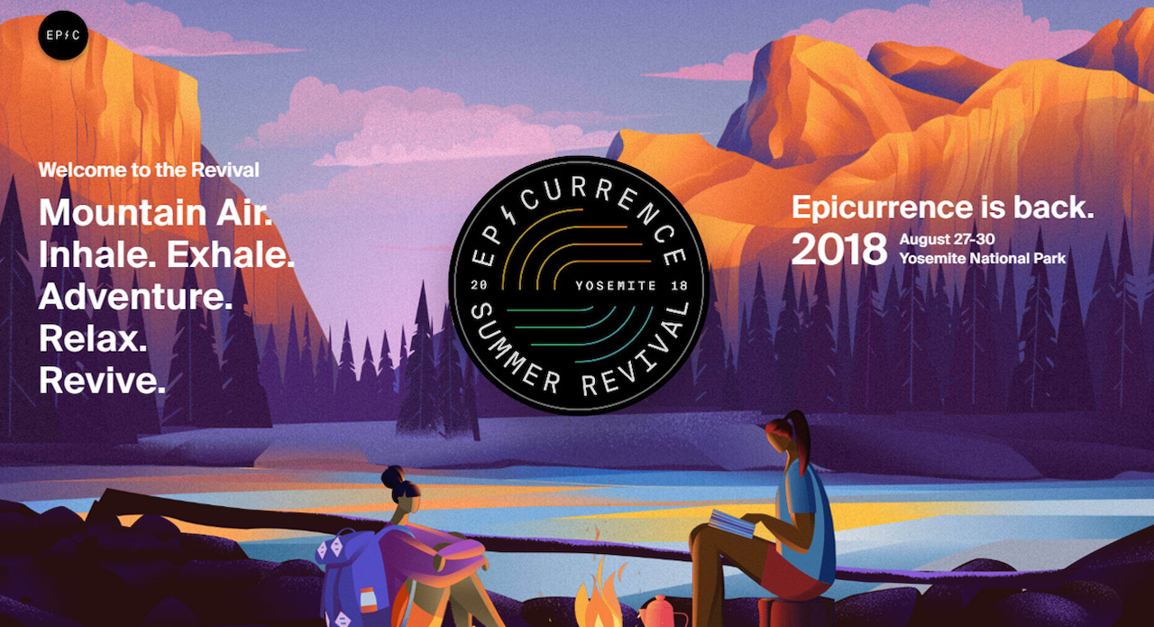
1. Simple, Catchy Entry
To eliminate one big myth first: There is no “fold” on a landing page. Trying to get all the seemingly important elements “above the fold” will make your header section messy and overcrowded. Instead, find a good, simple and catchy way to start your landing page: Start with a short and catchy title that draws attention and invests users emotionally in your product. If you use a visual, try making it simple and readable: A simplified screenshot of your app in a device frame works well, a playful illustration that sets the tone or even a simple moody stock photo that conveys an emotion. Same goes here: Do not overload users, but also make clear: There is more!
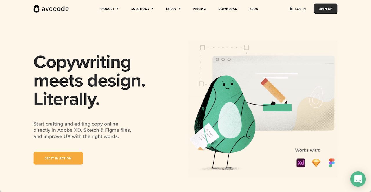
2. One Very Clear Call to Action
Speaking of conversion, think about what you want your visitors to do, and make it very clear for them. We call this: Call to Action. A call to action is not only a nice big button, but the whole context. Avoid generic texts like “Learn more …” or “Contact us”. Instead, try to manage expectations with your call to action, like:
- Start your FREE 30 day trial
- Book a call with Katja
For successful call to actions, the context is important: Make sure that your nice big button has enough white space around it to properly stand out. Provide information about what is going happen next or what is not going to happen. A simple hint like: “No credit card required” might be an amazing conversion driver, taking the fear of being ripped off of users.
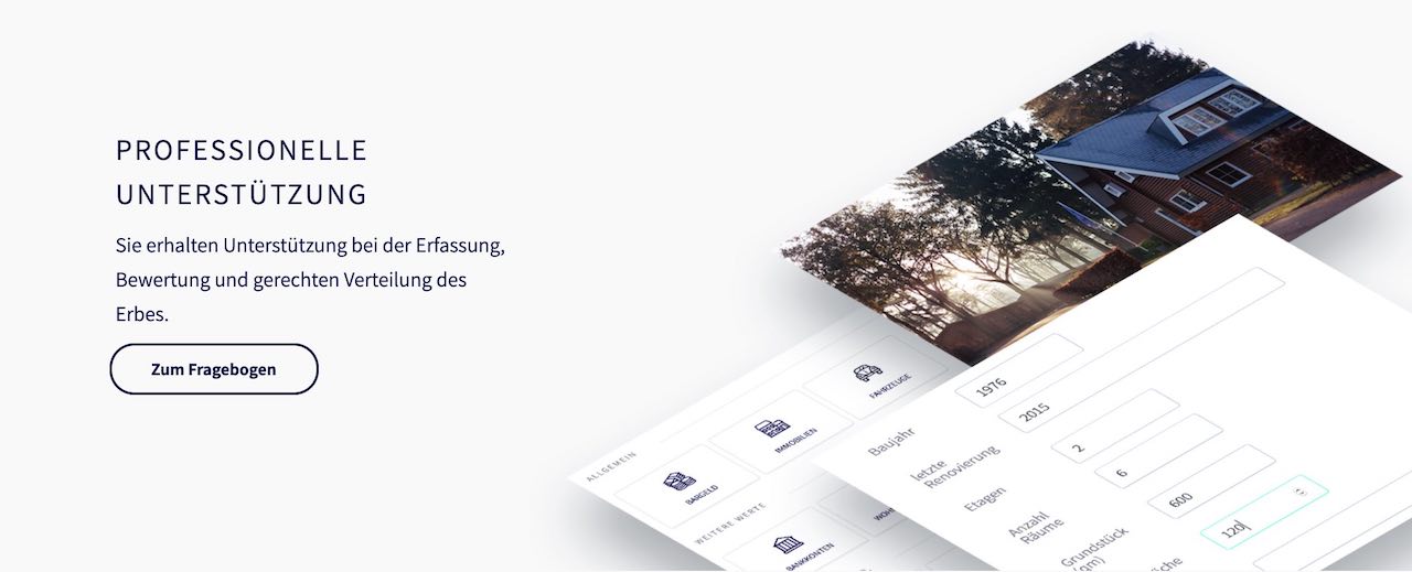
3. Concrete Product Showcase
When your landing page is for a concrete product (and it usually is), make sure you show and explain it. Especially in B2B, landing pages often make the mistake of trying to stay too vague around what the user will get, excusing it with “it’s too complicated”, “it’s super individual” or “We will overhaul the whole thing”.
Explain features and requirements, show photos, screenshots or even videos. Take some time to do so – users love to see your actual product before they use it.
In best case, you will have a customised version of your product for the landing page that idealises and simplifies your product, showing demo data, focussed interfaces or even highlights the important sections.
4. Structured Information
Think of all the questions that a visitor could have and try to answer them, in a simple and structured way. A good way to do this is a kind of FAQ section: Short questions, clear & short answers. Don’t be afraid of being redundant: What you want to have here is an inclusive and accessible experience, where people get the information, even if they missed it in the first 3 placements.
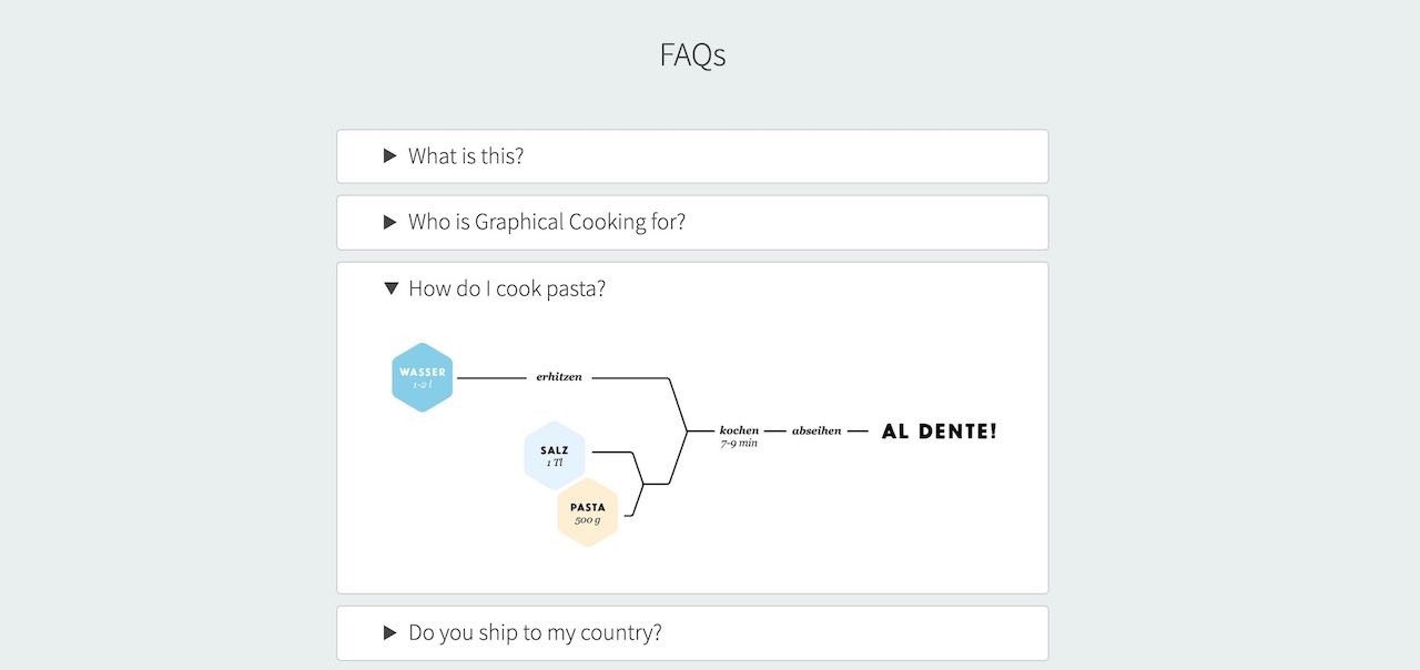
Structuring information in a simple and expected way helps users to consume it very quickly – don’t try to be too innovative here, this will rather scare people.
5. Show your Face
Lastly, show the team: Who is making the product? It may seem irrelevant to the product, but we Human beings tend to trust other more than we trust products or concepts. So in order to build an engaging, converting landing page – make sure that you are a part of it.
I hope these help you create or improve your own landing page. What other best practices do you have? Let me know on Twitter or Instagram: @johannesippen