The Xerox Principle

Close your eyes. Picture a photocopier. An imaginary Xerox machine. The one from your office or from school. In that imaginary photocopier, you want to make an imaginary copy. You know what to do, right?
In an article I wrote a few years back, I critizised then Yahoo CEO Marissa Mayer for not treating her brand right. You can read all about that in the original article. And yes, while her position as boss of former internet giant Yahoo didn’t end too well, there is a few things that I have learned from Mayer, that I apply in my everyday work and teach my students. One those things is the 98% rule, or: The Xerox Principle.
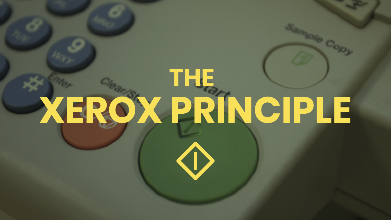
In her days as product designer and usability lead at Google, Marissa Mayer believed that a product should be designed around the way it will be used for 98% of the times. Take a Xerox copy machine: While these magic machines can Fax, Scan, Enlarge, Duplex, Bind or Email PDFs, in 98% of the cases, all you want to do with them is: make a simple photocopy. Instead of grouping this function with all the other magic tricks it can do, the common photocopier does a big button that does only that: Make a single copy.

Marissa Mayer teaches us that every app and every website should have a button like that. A big blue button that does the main thing that 98% of all users want to do with your app. Almost every Google App has this, Material Design has a dedicated floating button component that is reserved for the main action.
What does that mean for me?
If you are able to identify this main function in your app, try putting this function in a very prominent place. Don’t be scared to de-emphasise other functions for the main function, users will eventually find them - while thanking you for making your live easier on the go.
Imagine a Xeros machine – what is your big green “Make a Copy” button?
